A redirect wearing a search box.
The panel dropped from the top of the page with a search field and a row of popular-search pills. The pills mixed garment types with collection names, which is how customers arrive. But they were links. Tapping one left the page.
The field itself did nothing until you submitted. Type "leggin" and the panel showed a single line — Show all results for "leggin" — and then several hundred pixels of white. No image, no product name, no result count. The interface had the answer and declined to show it.
That is a search that cannot fail informatively. If the query matched nothing, you learned that after a page load. If it matched forty things, you also learned that after a page load. The cost of asking was the same either way — so the rational move was not to ask.
The panel stays put and fills the other half.
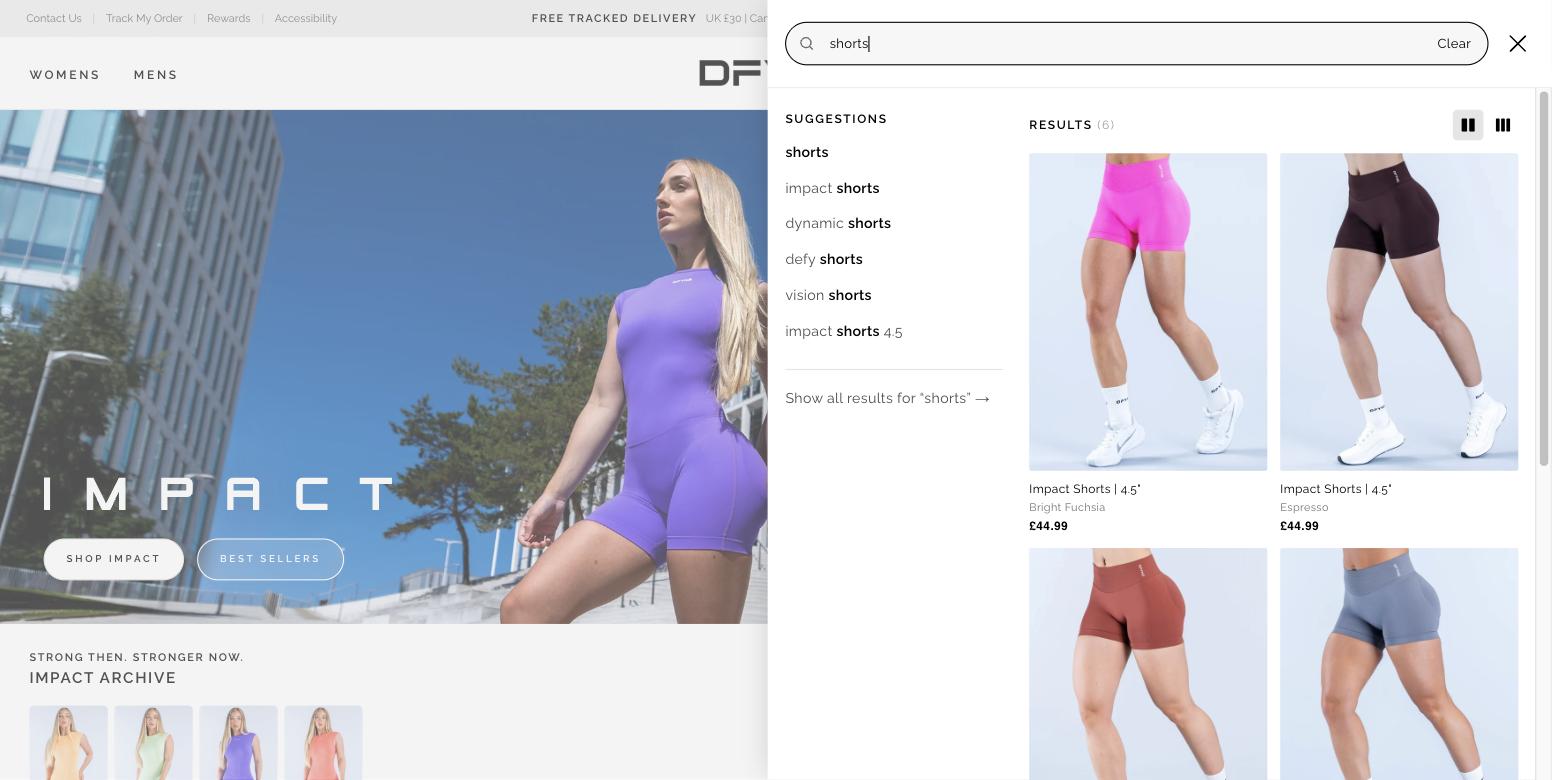
On desktop the panel takes the right half of the window and splits in two: suggestions on the left, live product results on the right. The page behind stays where it was, so a search is no longer a departure — you can look, decide it was not what you meant, and carry on.
Results update on each keystroke and carry the things that decide a click: image, name, colourway, price. A Show all results link stays at the foot of the suggestions, so nothing was taken away — the page load simply stopped being the only route to an answer.
Suggestions that know a range from a garment.
Type shorts and the suggestions are not variations on the word. They are impact shorts, dynamic shorts, defy shorts, vision shorts — the garment crossed with every collection that makes one.
This is the mega menu's argument in a different control. A large share of customers arrive holding a range name they heard from an influencer. A search that treats Impact as an ordinary string throws that away; one that completes it turns a half-remembered name into a route. It also works in the other direction — someone who only knows they want shorts is shown, for free, that shorts come in four ranges. The catalogue teaching itself without a landing page.
Colour arrives in the results, not the filters
"pink leggings" is a colour and a garment in one query, and the search resolves both rather than matching neither.
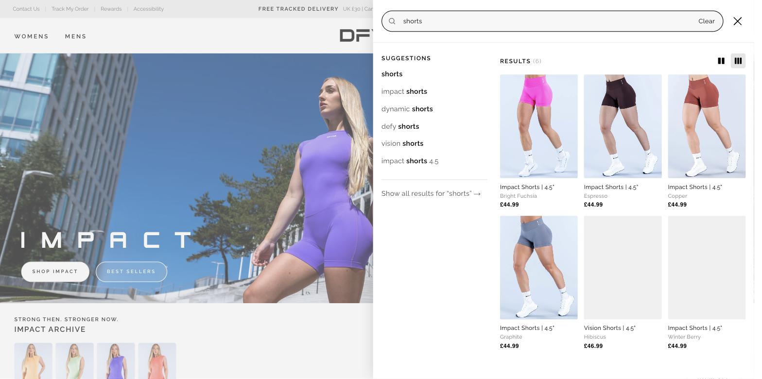
Every result card names its colourway under the product title — Hibiscus, Light Rose Pink, Espresso, Copper, Graphite, Winter Berry. At a brand where a returning colourway is a marketing event, that word is not a spec, it is the reason for the purchase, and it belongs where the decision is made.
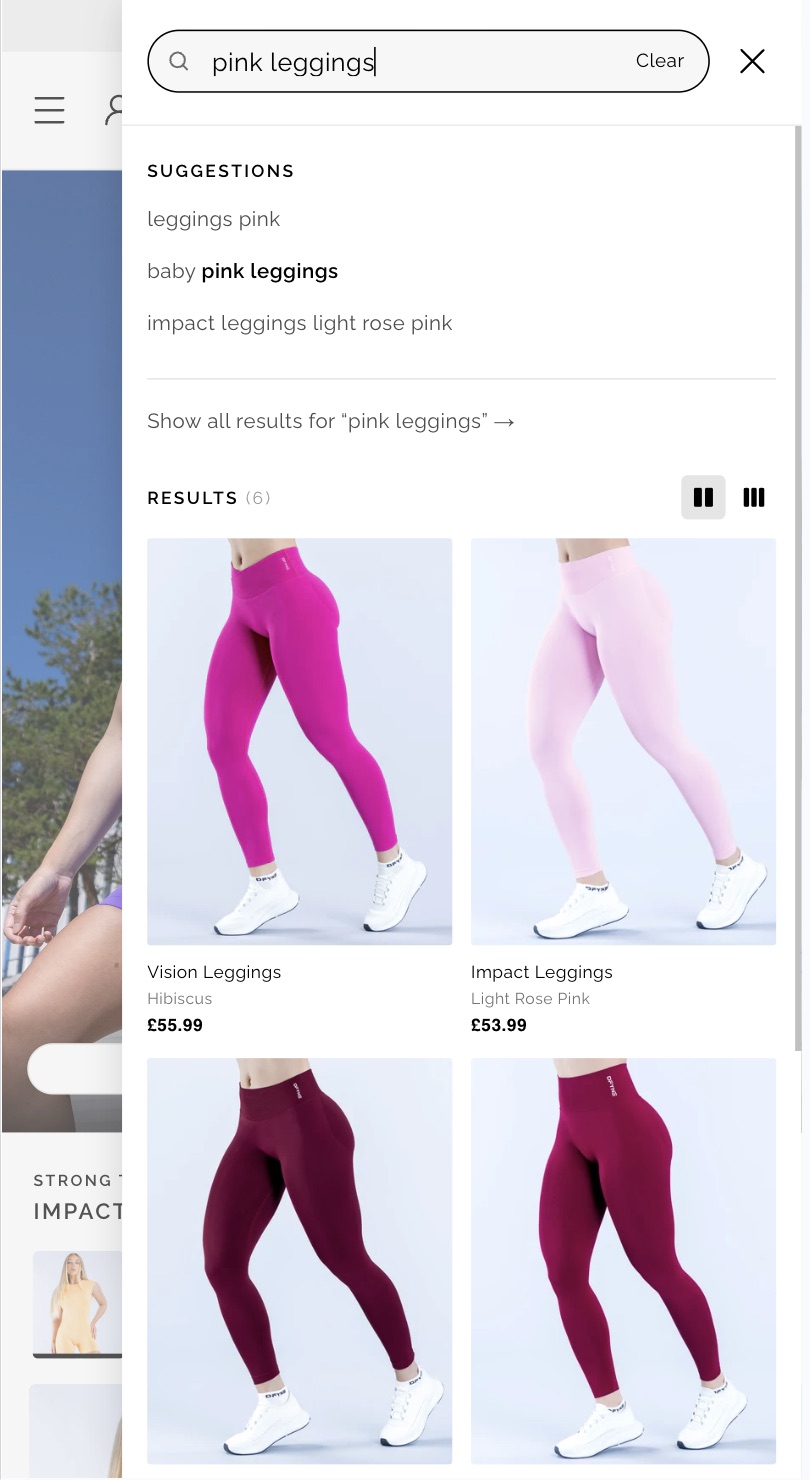
pink leggings offers leggings pink, baby pink leggings and impact leggings light rose pink — the same three axes recombined: garment, colour, and the collection that happens to make it in that colour.
The alternative was the journey the old site had, and the one the mega menu also removed: land on a listing page, open the filter panel, find colour, apply it. Search collapses that into the sentence the customer would have said out loud.
Looking and hunting are different jobs.
The results grid has a two-up and a three-up state, switched beside the result count. It is an unusual thing to ship in a search panel and it earns its place: a customer who knows the product wants to scan as many as fit; one who is deciding wants the garment big enough to judge. The suggestion column holds its width and position, so the toggle changes the answer's resolution without rearranging the question.
The empty state has a job
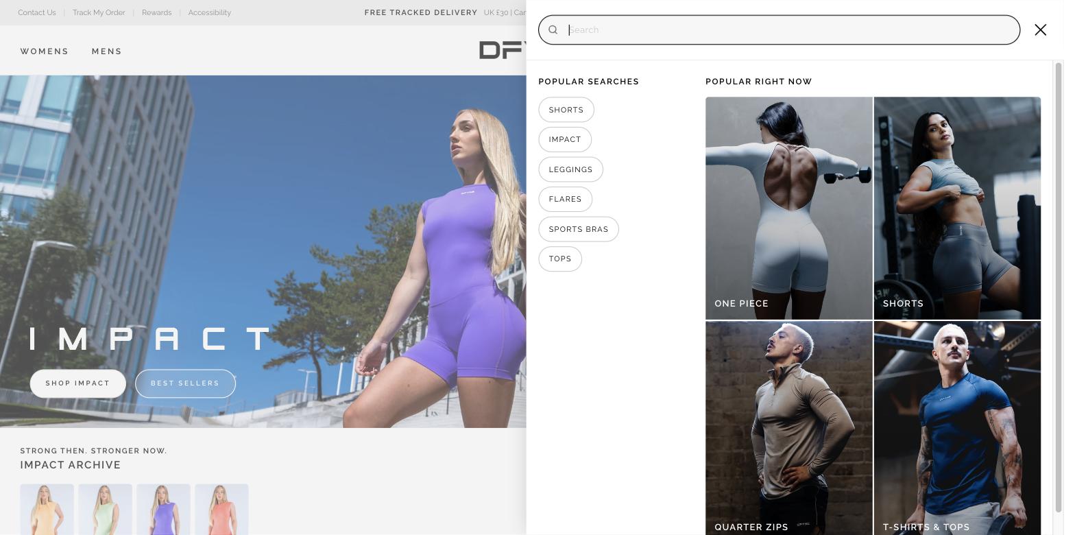
An open search box with nothing typed is the most common state the panel is ever in, and the old one filled it with five pills. The new one splits it: Popular searches keeps the pills, and Popular right now fills the other half with four editorial tiles. Two are womens and two are mens, so the panel does not assume which side of the catalogue the customer is on before they have typed a character.
The same panel on a phone
Mobile takes the full screen rather than a half-panel, and keeps the order — suggestions, the link out, then results. The density toggle survives, which matters more here than on desktop: two-up on a phone is a genuinely different browsing speed from three-up.
The field keeps a Clear action inside it rather than making the customer hold backspace — the difference between refining a query and abandoning one.
Directional, and I would rather say so: I no longer have access to the analytics to put a number on this one. The change that is measurable in principle is the cheapest to state — the old panel could not show a result without a page load, and the new one shows six before you have finished the word.
Average order value up 13%, items per order up 20% — by building for the set rather than the garment.