The marketing knew. Digital didn't.
DFYNE's customer is an 18-to-25 year old woman in Australia or America, and 67% of them are returning customers. These are not one-off purchases — they are people who live in the brand and already know the range.
The marketing is extremely heavy on influencer partnerships, and what those influencers show is the full set: the top, the shorts, the leggings, the sports bra. That was well understood inside the marketing department. It had never made its way to digital.
I was the first member of the digital team. Nobody at DFYNE had worked with digital before, so part of this job was building those relationships from nothing and showing why bringing digital into campaign planning makes a better experience. Quick Add is what that argument looked like once it was built.
Six screens, one page.
The old journey was a product page per garment. Showing this end to end is the point — you can see how short it is without scrolling for a minute to find out.
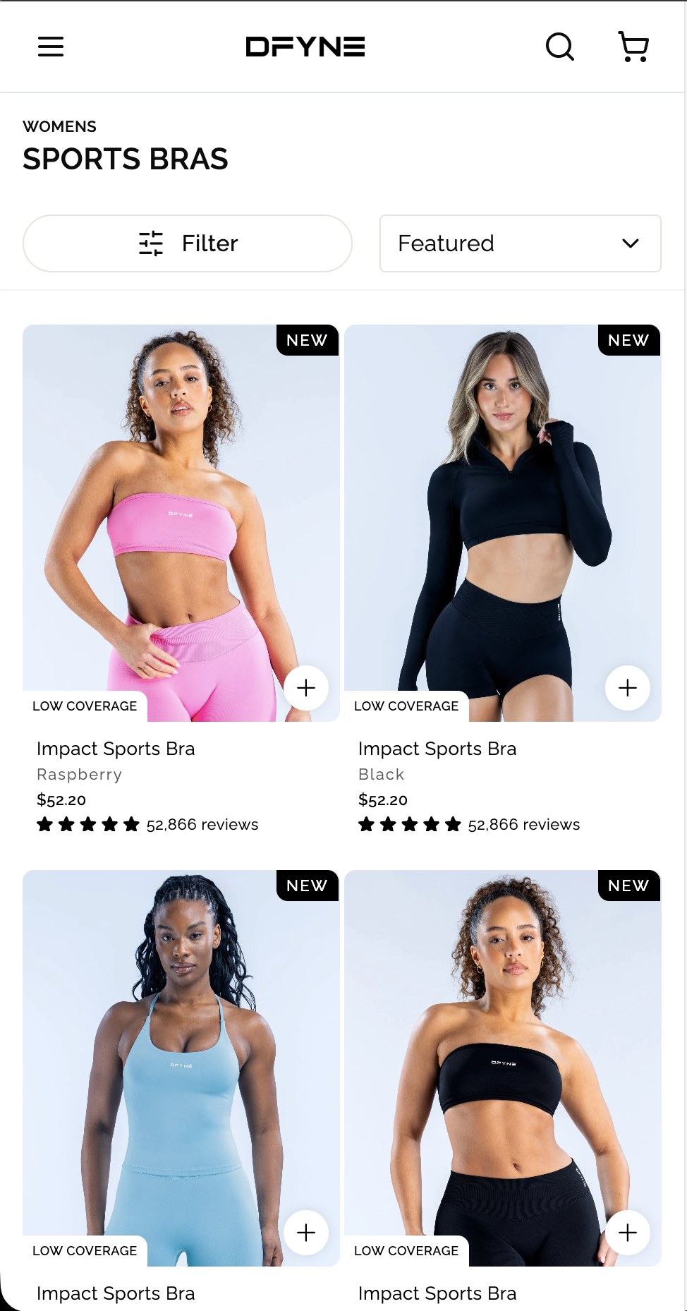
A plus on every card. No product page needed to start.
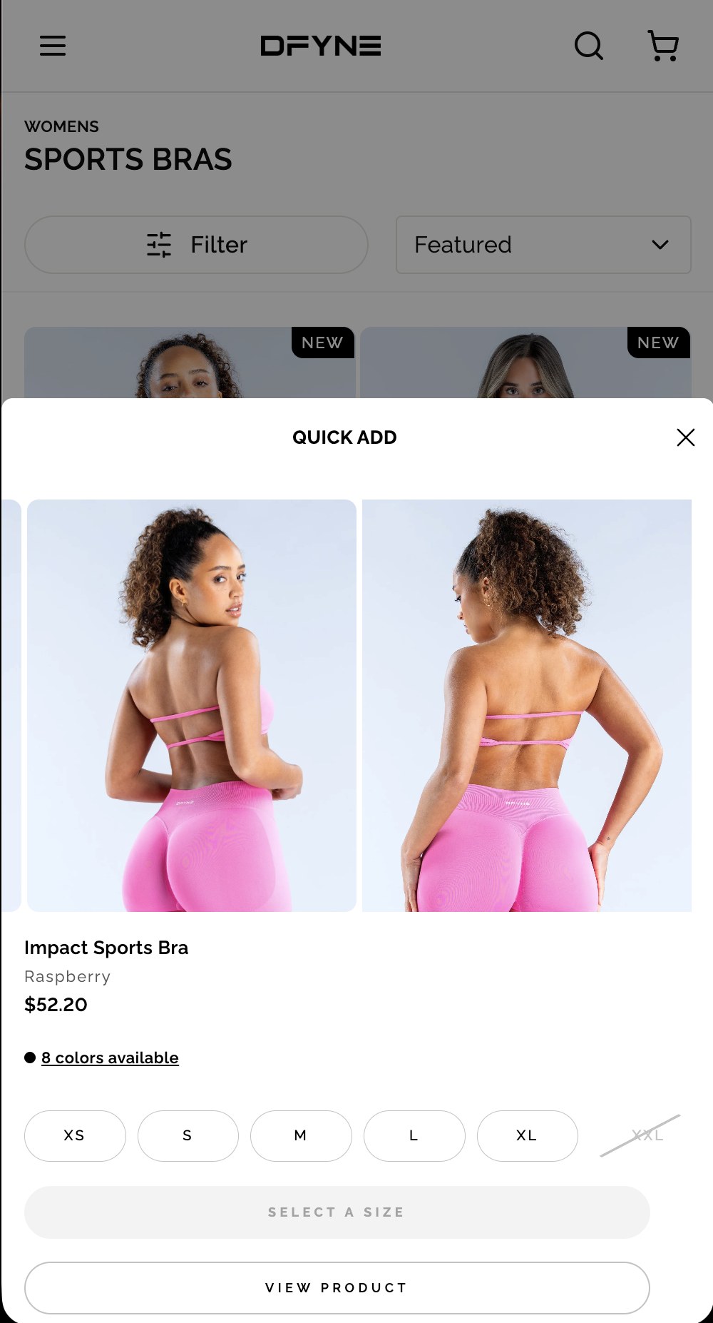
The button reads Select a size and is disabled — the instruction is the control, so nothing can be tapped and fail.
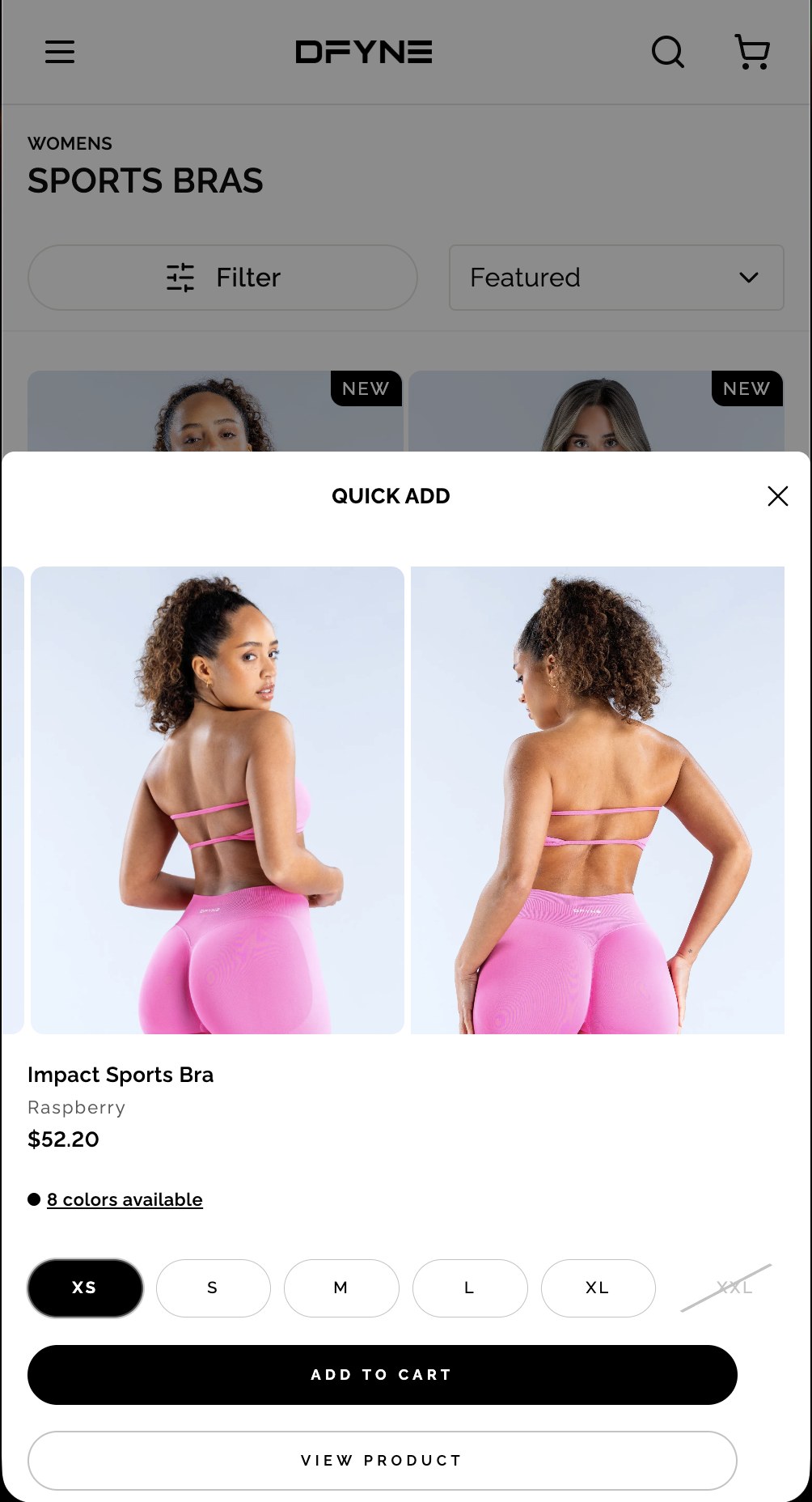
The same button becomes Add to Cart. View Product stays underneath.
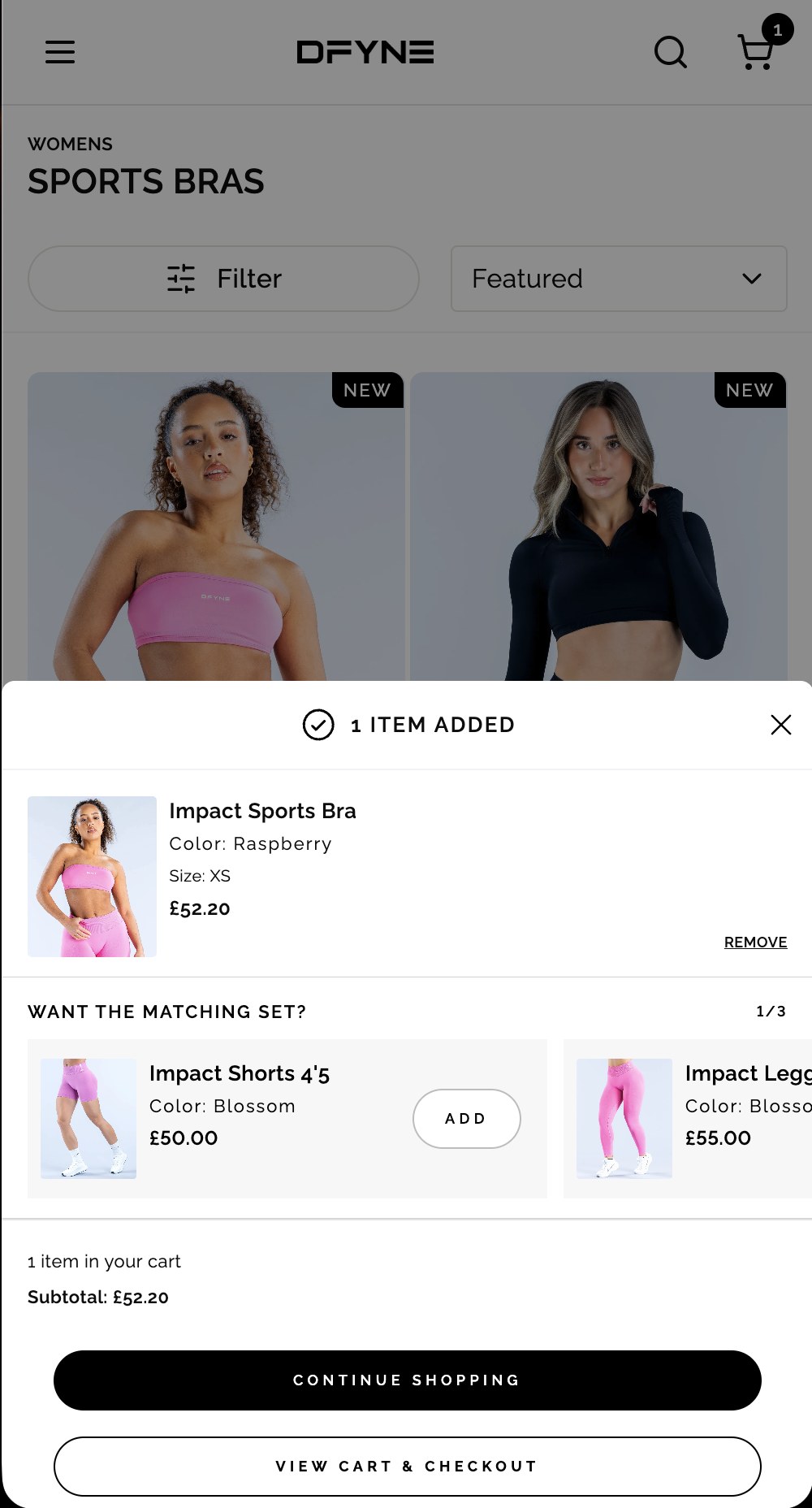
Want the matching set? sits inside the confirmation, above the subtotal.
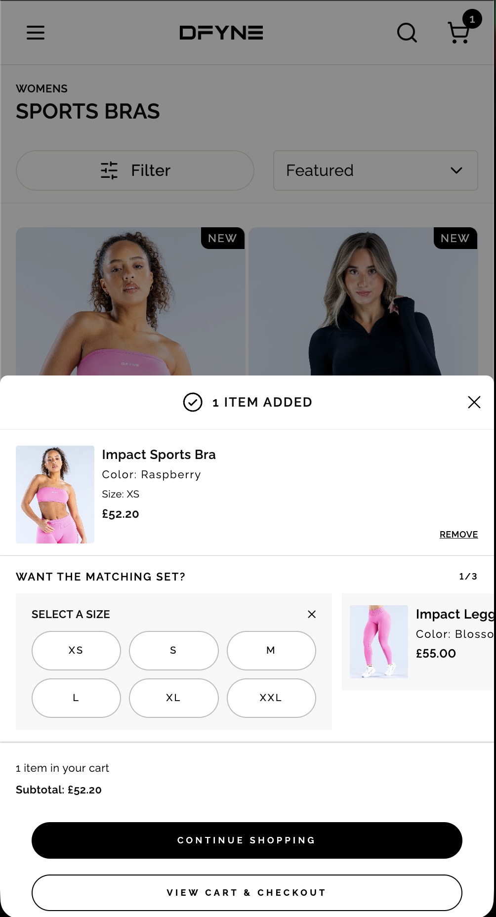
The picker opens inside the slot the product occupies. No new screen, no lost position.
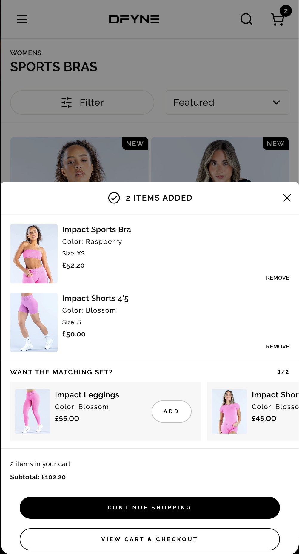
The set counter drops from 1/3 to 1/2. It reads as completing a set, not working through a list.
Only what it takes to decide
The first version was closer to a mini-homepage in a sheet. Nothing about it failed in testing — it was simply more than the decision required, and it got stripped back across several iterations to what someone actually needs in order to say yes: the garment from a couple of angles, the name, the colourway, the price, and the sizes.
Complete the Set arrived around the third iteration — once the sheet had been reduced far enough that there was room to ask a second question without crowding the first. The feature this case study is named for was not in the brief. It emerged from cutting.
The moment a customer has just said yes is the moment they are most willing to say it again — so the set lives inside the confirmation rather than somewhere after it.
What appears in those slots is chosen by the ecommerce team. Working with the developers and the campaign managers, I built it so buying and merchandising can decide what gets promoted there — which handed them a way to put underselling product in front of millions of customers, at the point of highest intent, with no other route to that audience anywhere on the site.
The suggestion is a complementary colourway rather than a matching one — the Raspberry bra against Blossom shorts. That came from watching influencer accounts: they were mixing colours, which DFYNE never pushed as a brand. The set follows what customers were already doing rather than what the brand was saying.
Adding a second item does not send the customer anywhere. Sizing a whole outfit at once is four decisions held in the head simultaneously; sizing one item, then the next, is the same work broken into pieces a person can actually finish.
- Open product page
- Select colour and size
- Add to cart
- Scroll to related products
- Click through to the next product page
- Repeat for each item in the set
- Tap Add on the collection page
- Select size
- Item added, and the matching set surfaces
- Repeat inline for each item
- Checkout from one page
Average order value rose 13% year on year; items per order rose 20%, from 2.0 to 2.4. The lift is in items per order rather than spend per item — exactly what a set-building flow should move, and the reason the thesis held.
Putting the community on the front door, and selling the fit without forcing the bundle.