Nothing in the menu led the eye.
The structure was already sound. I kept it.
The menu I picked up already separated Shop by Category from Shop by Collection, and labelled both. That was the right call — the research I ran later backed it, and rebuilding a working structure to put my name on it would have been vanity rather than design.
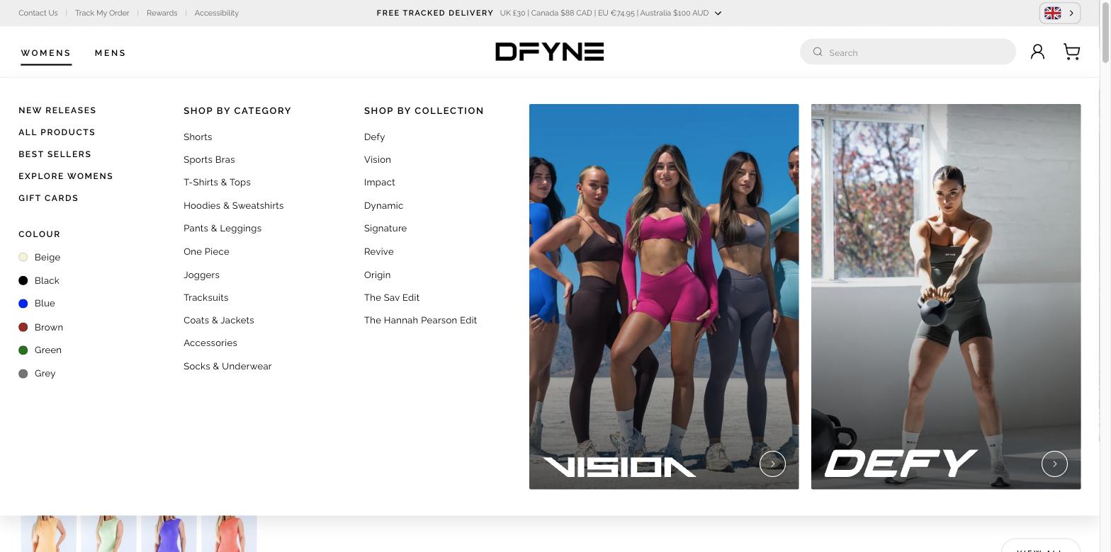
What it lacked was any acknowledgement of the drop. Four quick links, two labelled columns, white space where the right-hand half of the panel is now. And no colour anywhere in the navigation, on either breakpoint.
The menu answers three questions at once.
A customer who wants a garment type uses Shop by Category. A customer who followed a drop uses Shop by Collection. A customer shopping a colourway uses the colour list. Each is labelled, and each lands on a listing page that already reflects the choice. Plenty of activewear navigation still blends the two into one list that assumes you know Impact is a range and Shorts is a garment.
Putting a filter in the navigation
Colour is a listing-page filter, and I moved it into the menu. At DFYNE that is not a small call: new colour drops and the return of retired colours are core marketing events. Colour is brand, not just a facet.
Session recordings and heatmaps in Microsoft Clarity showed customers reaching for the colour filter specifically — not filters in general. That is a journey costing a step it should not: land on a listing page, open the filter panel, choose a colour. Promoting colour into the navigation collapses three actions into one.
A fixed skeleton, variable contents
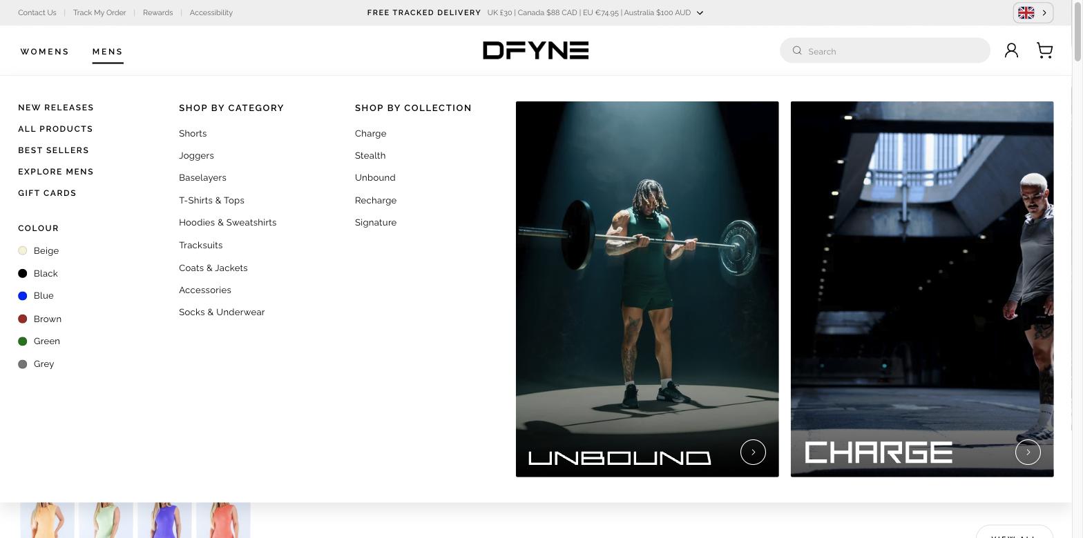
The mens menu carries nine categories and five collections against the womens menu's eleven and nine. The layout does not reflow to absorb the difference — the columns hold their positions and the shorter lists simply end earlier. Someone who has learned one menu can use the other without re-reading it, and the menu is driven by data rather than built twice.
The three doors survive the small screen.
Colour stayed a top-level route on mobile rather than collapsing back into a filter panel — the argument was only worth making if it held at both breakpoints.
On mobile the drawer carries Shop by Category, Shop by Collection and Colour as three peer accordions — the same three doors, at the same level, in the same order.
What does change is priority. On desktop the editorial tiles sit at the end of the reading order. On mobile they move to the top, under the gender toggle — so the current drop is the first thing in the drawer. For a brand whose customers arrive because an influencer showed them a collection, leading with the drop on the smaller screen is the right trade.
The menu tells you what a collection is for.
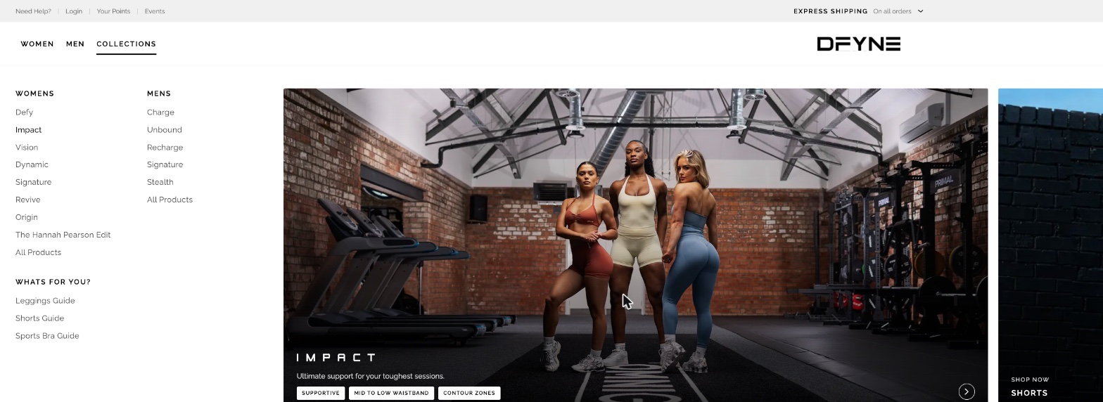
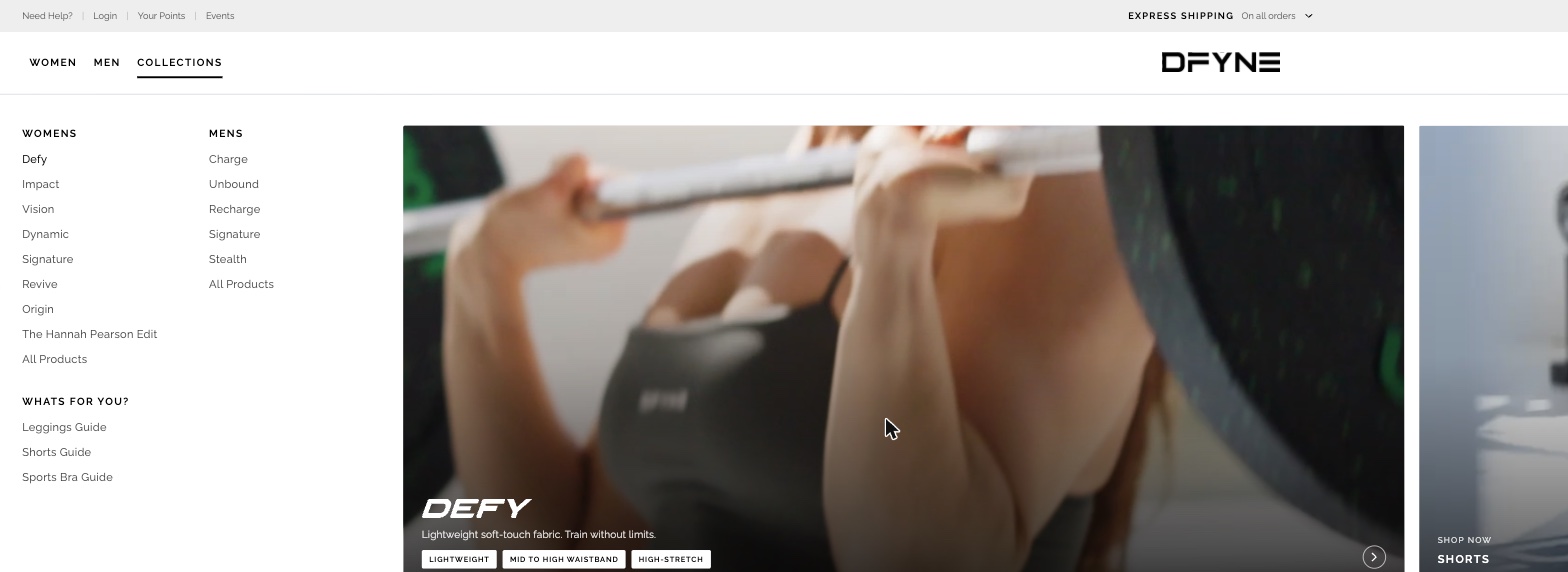
A top-level Collections item holding both womens and mens ranges, where choosing one surfaces that collection's DNA — the in-house term for what the clothing is actually built for.
Hover Defy and it reads lightweight soft-touch fabric, train without limits — lightweight, mid-to-high waistband, high-stretch. Hover Impact and both the imagery and the answer change: ultimate support for your toughest sessions — supportive, mid-to-low waistband, contour zones. Attributes rather than adjectives, and a different answer per range.
It reuses the marketing material already made for each collection and already seeded with influencers, so the menu speaks in the language the customer just heard it in. It tested well in-house and was not taken forward at the time. I still think it is the right direction, and it is the first thing I would revisit.
- A plain text panel: no imagery, nothing signalling what was new or selling
- No colour anywhere in the navigation, on either breakpoint
- Colour reachable only after a listing page and an open filter panel
- No route for a customer who arrived knowing nothing
- Category and collection split retained, and validated by the research
- Two editorial tiles per menu, so it leads the eye at the current drop
- Three labelled doors matching how customers arrive
- Colour promoted out of the filters — a two-step journey becomes one
- Explore Womens / Explore Mens landing pages for the customer arriving cold
Clicks on the menu went up 18%, bounce rate came down 10%, and customers reached a menu item 22% faster. Categories that were getting no clicks at all started getting them. The colour links — the decision that took the most arguing for — are the ones customers reached for, and the collections surfaced in the hero tiles took more visits. Measured in the analytics after launch.